Assignment 2: Photography Technique and Review
Assignment 2: Photography Technique and Review
Planning:
I will be taking images of the architecture in Teesside as I think there are several interesting buildings and sculptures in Teesside that deserve to be taken a snap of, there is a wide range of aged buildings and styles from modern, old and being run down. Around college area are a series of modern style buildings that I could use for my images, I have found some of these buildings on Google and I will use some of these buildings for my photography work.
The first structure that I will be doing a photography piece will be this architecture structure built in Middlehaven next to our college.

I feel like this is a great example of the architecture in Teeside, it shows complex creation in its unique design and is simply an art piece.
When I take this photo I will try use unique ways of showing it off, by showing its beauty through close up imagery for more detail of what it is, I can use leading lines to try and lead up to the structure as well. I will use composition to create a fairly symmetrical image and to use the rule of thirds to help this.
Jill Tate is a photographer from Yorkshire that takes images of interior and exterior architecture. She has a strong use of the rule of thirds, symmetry
and composition. This is how I am aiming my photos to look similar to my style is hopefully going to be similar as I really like her work.
Here is a link to her photography page of her interior and exterior photography pieces.

So here is a quick trial photography photo I took, this is a long/wide shot of the structure, in this image I show some composition by having the structure in the center of the frame, the water in the bottom of the frame and the sky in the top of the frame this utilizes the rule of thirds successfully however I will not be using this as a final photo as the actual structure isn't position very well in the image, it almost isn't the main focus of the photo. I will be getting a close up version of this structure as well. In the final image I will edit it in Photoshop.

Here is another quick trail shot of a closer photo of a part of the same structure. This shows the structure better however the stadium is in the background interfering with the structure in the image.

Here is a image of an cargo boat that is also around the area, this may not normally be seen as architecture at first however this has a lot of structural pieces on the boat with the scaffolding and the unique design must have been created by an architect and I think this goes under the category well. Now my final photo is very similar however in this image the camera is not zoomed in enough making the main focus (the boat) not being the main centre of attention.

Here is an image of our college that I took, I will not be using this building in my final photos as there was no good locations to take the photos from meaning there was always things interfering in the pictures to ruin the rule of thirds, this image shows it trees are and other foreground objects are in the way taking the focus off the building. Also I don't think this building should represent Teesside due to its unusual possibly ugly design.


Here is my risk assessment for my photography outing, this ensures my safety during the photos.
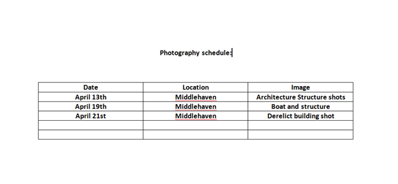
This is my schedule for my photography shots.


These are my photos of the structure from Middlehaven. I feel like this really shows off the unique art of architecture in Teesside. I cropped this image to make sure the composition was correct otherwise there was some space in random parts of one of the sides to the photos.
I did not use leading lines in this image as this would mean I would have to take the image from a distance the problem is this is that it takes away the grand size and appearance from the structure this means that I can focus on more of the structure and less of the surrounding areas, exaggerating its appearance. I really like this sculpture because of the complex style of the wires all interconnecting; also the grand size of it really makes it something.


For my editing I brought it into Photoshop and cropped both to the correct size I wanted some had extra unneeded space. For both images I first went into adjustments brightness/contrast and took down the brightness and then boosted the contrast this made it appear that it was shot in a darker atmosphere. Also I went into exposure and boosted it up for the first image but took down the gamma this means that the dark areas stay dark but any bright areas get exaggerated. I left the vibrancy and the colour balance for the first both as I was happy with this.

This is my image of the boat structure based on the river going through Middlehaven. Here I position the boat to the left of the screen this helps with the composition of the picture, if it was in the centre from the angle I was at it wouldn't work and would seem to look weird. Rule of thirds does somewhat apply to my image here with the bottom of the frame being the water then the rest spread out throughout the frame.

For this image I again took down some exposure to make it appear darker, also I took away some saturation and vibrancy to make the colours less bright as here I am going to the dark and gloomy look. I feel like with the darker appearance it shows off the clouds better than when it's lighter.

This picture is taken next to one of the structures I have already taken which you can see in the left of the image. Here again I have used the rule of thirds to put the building in the center of the screen as this is its main focus, the bottom of the frame is the floor/concrete, centre being the building and the top being the sky. I feel like this abandoned building goes really well with the unseen Teesside as this building would not normally be recognized by someone living in the area, but I feel like this image really shows it off well. I feel like the broken windows in this image really make the building look older and creepy. The red/orange brick also goes with the idea of the building being dangerous as red is known as the colour for "danger". The broken glass also goes with the danger theme.

Here I have darkened the image by taking down the brightness in adjustments, and I also boosted the contrast slightly, I did this to make it appear again darker and gloomier. In colour balance I added some blue and cyan to make the picture look colder. Also I booted the saturation and vibrancy slightly.

For this photo I took next to the building from before, here I once again use for the rule of thirds for composition in my image. The structure being in the centre of the photo and the rest surround. I feel like this structure goes well with the industrial areas in Teesside as there are so many. The rust on the building really adds to it in my opinion as it really goes with the theme of industrial buildings, as rusting metal is associated with it.

Here I darkened the image again and also added some blue in colour balance this was to exaggerate the fact that industrial buildings being a negative in Teesside. As they are there for pollution and people complain about having them in places due to what they are for and how they look.
For my images I feel that it would appeal to fairly an old audience as younger audiences would not appreciate architecture or care about industrial estates in a area. This applies to both genders as they will both be interested in this sort of style of photography.


Comments
Post a Comment