Digital Graphics Assignment 3
Digital Graphics Assignment 3
The clear main theme this artist has with his music is an underwater, sea and fish theme I think it matches his style of music really well and therefore should definitely be included in the logo and CD cover. This means I should use the colour blue as its main theme colour of the logo and cover. I think using some under water animals will also go well in either the logo or the cover as he uses this in his videos. Also the band name being "Prawnshocker" I could use his band name in the logo and cover, maybe using prawns (an underwater creature) or the word shocker use this to go into the logo.
I will be using Adobe Photoshop as this I think is the most suitable for this type of project.
For my first idea I will be using the idea of having several lightning bolts surrounding sea creatures, I think my best bet would be to use prawns for the title, then the logo will match the title perfectly. I will probably go with a blue and orange gradient background so that both the lightning bolt theme and sea theme work, also using a gradient can make the background look more interesting. Then inside this background will be sea creatures such as prawns and fish to go with the sea theme this artist is going for.

Here are some logos that I found on "https://www.colourbox.com/vector/set-of-diving-vintage-labels-and-logos-vector-19192327" I feel like this sort of style looks really smart even for it's fairly silly over the top theme. Something like this could really work, its lack of colour I think actually adds to it looking more professional although it does lose some personality.
I could also go for maybe an animal theme and because birds were specifically mentioned, have that as a background or main theme of the cd cover or logo.

First I put the size of the page in Photoshop to suit the size of a CD cover. Then I copied an image of lightning bolts off google images and edited them to make them my own, by editing the colours and manipulating the shapes.
For my colour choice I wanted something that would link to the underwater sea theme and the yellow as well to go with the lightning/shock theme. I then copied my version of the electric bolt and then pasted them around in a circle, to implement both colours I used the gradient tool, so I picked the two colours that I felt were strong and used the gradient tool to merge the colours together.

Here as you can see I laid out the bolts so that they all point to the centre, surrounding the area in the middle, I left this to leave space for the centre image, this is when I imported a new image of a prawn to go with the main theme of "prawnshocker".

Here I pasted in the picture of a prawn then used the magic wand to select the white background to delete it so that only the subject of the image was left. Here I then rotated it slightly more diagonal to fit the space better as before it looked awkward. I then went into "contract and brightness" to brighten the image of the prawn a bit to make it stick out more on the cover, I also went into "vibrance" to make the image of the prawn more vibrant so that its colour popped out a bit more.

For the background originally I used the same gradient colour that I used the lightning bolts for however this did not match the theme of it being disturbing as well as about sea life so I used a very disturbing image of google images to create that theme that I did not use before.
All that was left was the title of the band and the album name, for the band name I wanted it to really stand out on the cover so I used a bright colour to contrast against its dark background. This colour being cyan also matches the sea life theme. For this title I used a font I used "Myriad Pro" that was quite simple, big and bold. Also I rotated the text slightly on each side so that it appears a bit off this is to help with its strange disturbing scene.
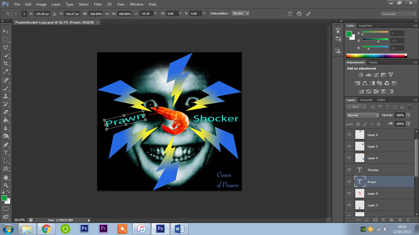

I really wanted it to stand out on the cover, I added a background glow to the font to further enhance its way to stand out on the cover, to do this I changed the outer glow setting put the opacity to 100% and added some noise and size to the glow this gave it an electrical shock look which match the title theme really well whilst also making the text stand out more.


For the other text I wanted it to contract against the band name title by using a almost typical style of placement and font type. Here I use an "SavoyeLetPlain" font which is a hand written fancy style of font which is similar to most hand written style fonts on most professional cd cover. I wanted to use this to contrast against the simple bold font of the band title font that is used. The placement also of the text is a typical way to place the cd title in a corner of the cover. Here is the final CD cover.

Evaluation of Digital Graphics Assignment 3
for my project I had to create a logo/CD cover in either Adobe Photoshop or Illustrator for a client that requested this for his music album, his artist name being "prawnshocker" also creating the CD cover with the name of the album being "Crown of Prawns". The themes the client wanted me to explore were Japanese Culture, animals, birds, insects or reptiles. Watching back on the clients videos he seemed to have a strong theme on sea life I thought that I would take advantage of this and use it in my CD cover to have the theme based around sea life also to have the title of the artist "prawnshocker" also to be used as a theme in my logo/CD cover.
I feel like my final piece mainly meets the requirements of my clients brief as I explored the strong themes of this music, expressing it well in the logo/cover. I also used the theme of his music being disturbing in my logo/cover by using a highly disturbing background and also making text appear unusual by rotating to unusual angles. I feel like I capitalized on the name "prawnshocker" well and also using the sea life theme well.
My client was generally satisfied with the work I produced, stating that he liked the "disturbing" background image I inserted for the background. He also stated that he liked the idea of the lightning bolts however they needed to fit the image better due to how the background looks against it. He also mentioned that he'd prefer a bolder font that will stand out more for the CD title.
I feel like my prawnshocker CD cover did meet the target audience that the client was going for, as he was looking for a disturbing strange theme and I feel like I implemented that really well into my CD cover.
The background image of my CD cover was definitely a big success as the client thought it went really well with the disturbing theme, also the ideas of the images I inserted generally did work they just need some refining.
The font for the CD name although I thought might be a nice idea, the client was not keen on and therefore I will take the clients advice and will change the font and colour scheme to make it bolder and simpler.
I feel like I was very strong with time management as I completed a draft of my CD cover and sent it successfully to the client for feedback on time. I also got my general idea very quickly so I knew what I was creating and have only been changing small parts of the CD cover. When finishing off the CD cover now I only have to make some small adjustments so I have managed my time successfully.
When getting the feedback I feel like the co-operation with the client was strong, however I do not have any communication from now so I do not know if my final work will be totally improved.
If I was to repeat the project I would try to have better communication with the client so that I can discuss what to improve in better detail. Also I would possibly try to work with vector graphics instead of raster graphics for different results.
Overall I feel like my work was generally successful, I would of preferred better communication with the client as said before however overall I think this was a positive piece of work for my project.

After getting some feedback from the client I changed the font on the CD cover that I sent him, the CD album name is now bolder with a glow behind it and the title has a yellow glow with noise added so it pops out more. I also tilted the text to make it seem off to add to the disturbing factor.


Comments
Post a Comment