Digital Graphics Assignment 1
Digital Graphics Assignment 1
For my digital graphics assignment I will be doing a re-touching of an old image on Photoshop, and will to turn a black and white, creased, damaged image into a new spotless colour photo. First I found the original photo on google images, I picked this as I thought this had a strong amount to repair and change and also will turn into colour nicely.
Here is the original photo I went for.
So to start off I downloaded the images off google images, I then opened Photoshop and opened the saved image. Here is the image without any edits in Photoshop.
First I noticed the creased all along the image, I first started off with the ones furthest away from the subject in the image as this was the easiest bit to do first, to remove the creases I used the spot healing brush, I made the size of it right enough so that it just covered the crease, to make it the most effective.
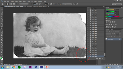
As you can see in this image I have completely cleared the circled area, this was by using the spot healing brush on the right hand side of the image. When using the healing brush I made sure I followed the crease completely so that the image did not get distorted.
I then moved on to the left hand side of the image and removed the creased areas towards the top left of the image, I again was not clearing any of the marks on the subject.
Here is the result of once I finished clearing the creases and marks on that area of the image again using the spot healing brush.
After doing the easy parts around the subject, I moved on to actually clearing the marks on the subject, for this I enlarged the image to make sure I did not distort the subject, I once again used the spot healing brush but with a much smaller radius so it suited the size of the mark on the area circled, I also used the clone stamp tool, I did this because the spot heal brush did distort very slight parts of the subject in the image so I used this over it to fix this problem. When using the clone stamp I made sure I was replacing the area with the correct image chosen so that it appeared correctly.
And here is the result after I cleared the circled area with the tools mentioned.
I then moved on to the bottom of the image (the area where the subject is sat), I did this bit after as it was a bit more difficult due to the size of the marks/rips, for this I again used a combination of the spot healing brush and the clone stamp tool, I started off by going over everything in that area with the spot heal brush making sure the brush size was correct for the crease size, but then finished it off with the clone stamps so that it wasn't blurred or distorted.
And here is the result of when I completed clearing this area of marks, using the tools mentioned.
Here I used the clone stamp to gain some of the image that was lost due to a rip/mark. Cloning the area to the left of it and adding it one.
I then moved back onto the subject, this time concentrating on the lower half of the subject, as I thought this was an important and possibly more difficult part to do. For this I just again used the spot healing brush to clear the mark on her arm and the unwanted creases on her dress.
Here I had to clear the marks around her foot, these marks were a bit more challenging as they was on her foot as well as the ground beneath her, so I once again used a combination of the spot healing brush and the clone stamp tool, I once again started off by getting the right size healing brush for the mark and then going over it, because of the mark covering 2 different things in the images, it blurred them together very slightly this is where I used the clone stamp to go over any un clean parts of the image.
Here is last time that I have to use either of those tools, all marks and rips have been fixed.
I noticed that around the images was almost a rip all around it and it was especially worse in the corners of the image, so I decided to crop the image down so that the rips would no longer be in the image, I could of attempted to use the clone stamp, which I did to fill out these areas however it made the image look too big and unnatural, so I cropped it down where the image looks far better sized.
Here is the images after all rips from the outside the image as well as in the image are removed, this looks much better from the start. I decided that I wanted to turn this into a colour image for an extra step to making the image more modern and improved. So I started off by using the pen tool and carefully going around the areas of the subject's skin, I made sure to avoid drawing around her hair as her skin colour will not be the same as her hair colour. I did not have to go around her dress as it looks fine as white along with her shoes, also the dress looks like it was white anyway, once I went round the areas I needed to add colour to I right clicked and then clicked make selection and then set the feather radius to 1 pixel, this means that it takes down the area by 1 pixel basically just in case you went over slightly on a part of the image you wouldn't want this can help to avoid that.
Once the selection was made I went on to image, then adjustments and then colour balance, I then changes the colour balance so that the black and white image of her skin would appear coloured but also actually have the correct look of skin, I achieved this by adding some red and pink and also a bit of yellow as these colour respond to skin very well. This is mainly just in midtones the other tones were not particularly needed to adjust.
So here is what I ended up with once I was happy with the tone of skin I gave the through adjusting the settings in colour balance.
I once again used the pen tool to draw around the hair of the girl as this still needed to be done. I then once again selected make selection and feathered it down by 1 pixel, I then went on to colour balance once again to get a hair colour, I needed to decide what colour I was going to give her I wanted the most natural look as possible so I decided a fair blonde, I added a very slight red, slight bit of pink, then mainly yellow. This is mainly just in midtones the other tones were not particularly needed to adjust.
Next I realised her eyes didn't look white enough, as they were the same as her skin colour, so I drew around her eyes with the pen tool, made another selection, feathered down by only 0.5 pixels this time as it is a much smaller selection, this time going into adjustments but hue/saturation so that I could change the light in the eye to make it appear whiter, I also went into colour balance and took away the red look from the skin.
I also drew around the pupil separate from the white in her eye, I made another selection for 0.5 pixels, and then I went into colour balance and added cyan and blue.
The last part was the put colour in the grass area she was sat on, so I once again used the pen tool to go around the area, I then made selection to be feathered by 1 pixel again as this area was a bit bigger, then I went into colour balance for the last time and added very slight green and yellow tone to it, I made sure not to make it too colourful and wanted it to merge with the rest of the image as best as possible.
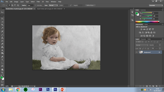
To finish off the image I went back into adjustments, to change the contrast and brightness of the images, I added more contrast to make the image appear more like a modern colour photo, and a bit of brightness as the image was a bit dull, I also then went into vibrance/saturation to add both a bit of vibrancy and saturation just so that the colours were a bit more vivid in the image.
Here is my finished image, I then saved it as a JPEG so that it was in a more useful format and that was my image complete.


Comments
Post a Comment